A workforce representation dashboard consolidates diversity, equity, and inclusion (DEI) data into a real-time visual tool, helping organizations analyze workforce demographics, equity metrics, and employee feedback. Traditional DEI reporting methods – manual data entry, spreadsheets, and outdated reports – consume time and fail to provide actionable insights. Dashboards solve this by offering continuous updates and uncovering trends like pay gaps, retention challenges, or promotion disparities.
Key metrics to track include:
- Representation: Workforce demographics (gender, ethnicity, age, disability, etc.).
- Equity: Pay equity, promotion timelines, and performance ratings.
- Inclusion: Employee feedback through surveys (e.g., belonging scores, eNPS).
- Talent Flow: Recruitment, promotion, and retention patterns.
Dashboards also enable leadership diversity tracking, trend analysis over time, and actionable insights by connecting quantitative data with qualitative feedback. Tools like Power BI, Tableau, and Skillfuel streamline data collection, cleaning, and visualization. Automating updates ensures data accuracy and reduces manual effort, allowing HR teams to focus on decision-making.
The result? Better monitoring, accountability, and progress toward DEI goals, turning raw data into measurable outcomes.
Diversity & Inclusion KPI Dashboard in Power BI
sbb-itb-e5b9d13
Key Workforce Representation Metrics to Track
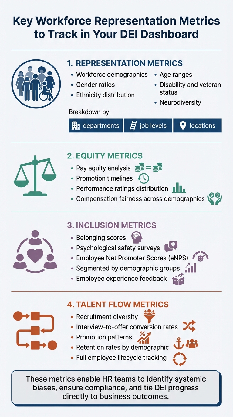
Key Workforce Representation Metrics for DEI Dashboards
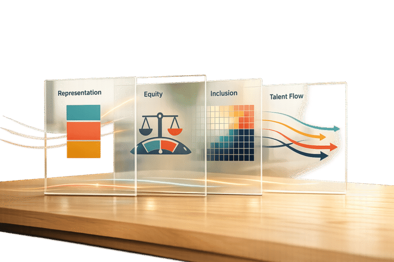
To get a comprehensive view of your organization’s DEI efforts, your dashboard should include metrics that cover representation, equity, inclusion, and talent flow.
Representation metrics focus on the demographic breakdown of your workforce. This includes gender ratios, ethnicity distribution, age ranges, disability and veteran status, and neurodiversity across different departments and job levels. Equity metrics evaluate fairness within your systems by looking at areas like pay equity, promotion timelines, and the distribution of performance ratings. Inclusion metrics delve into employee experiences, using tools like belonging scores, psychological safety surveys, and Employee Net Promoter Scores (eNPS), segmented by demographic groups. Lastly, talent flow metrics track diversity at every stage of the employee lifecycle – from recruitment and interview-to-offer conversion rates to retention patterns.
These metrics enable HR teams to go beyond surface-level commitments, identifying systemic biases, ensuring compliance, and tying DEI progress directly to business outcomes.
Diversity Metrics Explained
Organizations often make the mistake of viewing diversity too narrowly. To avoid this, track multiple demographic dimensions – such as gender, race, age, disability, veteran status, and neurodiversity – while breaking data down by department, seniority, location, and function. This deeper analysis can uncover disparities that broader statistics might hide.
For example, while overall figures might suggest balanced representation, a closer look could reveal gaps in leadership roles or specific departments. The British Transport Police (BTP) used the Oleeo Recruiting Enablement Platform to monitor diversity across 550 annual vacancies. By refining their application process and tracking real-time metrics, they doubled minority applicant numbers and successfully filled over 1,100 roles with a more inclusive workforce.
Tracking metrics like disability and veteran status does more than meet compliance requirements – it helps assess whether your workplace genuinely supports diverse needs and experiences.
As Shani Jay from AIHR points out:
"Language is powerful. When using language to describe groups of people, it’s essential to practice thoughtfulness and opt for humanizing descriptions."
Understanding how employees prefer to be identified builds trust in data collection efforts and encourages participation in voluntary demographic surveys. These insights can then inform leadership metrics, which highlight whether diverse talent is advancing within your organization.
Leadership Representation Tracking
Leadership diversity requires special attention, as it reveals whether employees from underrepresented groups are progressing within your organization. A funnel analysis can help by mapping gender or ethnicity ratios across various management levels. This approach identifies specific points where the talent pipeline narrows – often referred to as the "broken rung" or "glass ceiling." For example, while women may represent 40% of business ownership, they own only 21% of shares, and women of color hold just 4% of C-suite roles. By comparing leadership composition to overall workforce representation, you can pinpoint advancement barriers.
Other key metrics include promotion velocity, which measures the average time it takes employees from different demographic groups to achieve their first promotion. Unequal promotion timelines can reveal hidden obstacles that overall promotion rates might mask.
In 2012, the London Organizing Committee for the Olympic and Paralympic Games (LOCOG) implemented a monthly diversity reporting system to manage the hiring of 200,000 people. By providing detailed departmental reports, setting recruitment targets, and benchmarking performance, LOCOG exceeded its diversity goals for gender, ethnicity, and disability.
Incorporating succession planning data is also essential. Tracking "high-potential" designations and participation in mentorship or sponsorship programs can reveal disparities in access to leadership opportunities. If high-potential designations don’t align with overall workforce representation, it might be time to reassess your talent identification processes.
Trend Analysis Over Time
While snapshots offer a momentary view, tracking trends over time is crucial for understanding progress. Monitoring hiring, promotion, and retention patterns – disaggregated by demographic group – helps measure long-term progress toward DEI goals.
Talent flow analysis provides additional insights by examining how employees move into, through, and out of your organization. Tracking hiring, promotion, and termination data alongside recruitment pipeline stages (from applications to offer acceptances) can reveal drop-off points that may indicate unintentional bias. For instance, if retention rates for a specific demographic group are significantly lower than hiring rates, it could signal underlying challenges.
When targeted initiatives, like sponsorship programs, lead to measurable improvements – such as reduced promotion timelines for underrepresented groups – it’s a clear indicator that the intervention is working.
Modern dashboards increasingly use AI to analyze qualitative data, such as open-ended survey responses and exit interviews. This approach can identify underlying issues, like insufficient sponsorship or subtle microaggressions, that may contribute to higher turnover among certain groups. Unmesh Sheth, CEO of Sopact, highlights this connection:
"DEI metrics only drive change when quantitative representation data connects to qualitative inclusion feedback in real time."
Longitudinal tracking with unique identifiers allows organizations to follow individual career trajectories, enabling a more thorough evaluation of DEI initiatives. This method confirms whether interventions are delivering measurable results, helping to refine strategies over time.
Establishing a regular review cadence – such as monthly stakeholder meetings – ensures that data-driven decision-making becomes an integral part of your organization’s culture.
Collecting and Organizing Your Data
Accurate, organized data is the backbone of turning DEI metrics into actionable insights. Start by gathering reliable HR and recruitment data. Tools like Skillfuel’s centralized platform make this process easier by allowing HR teams to screen applicants and track their progress in one place. The software creates detailed candidate profiles by analyzing resumes, social media activity, and online publications, feeding this information directly into your representation metrics.
When working with Skillfuel, focus on extracting DEI metrics that lead to meaningful actions. According to Skillfuel, "Metrics are an extremely important part of your recruitment process where success is measured beyond the number of positions the team has filled". Pinpoint areas that need improvement, such as turnover rates or sources of hire. Skillfuel’s high-match algorithm also helps identify a more diverse and qualified candidate pool, enriching your data for deeper representation analysis.
Once your data is collected and refined, the next step is transforming it into effective visualizations.
Pulling Data from Skillfuel
Skillfuel’s Applicant Tracking System (ATS) acts as a central hub for building representation dashboards. It maintains a centralized repository that tracks demographic details, application stages, and hiring outcomes across your talent pipeline. To expand your data set, consider incorporating information from specialized job boards like Diversity Working, Black Career Network, or Recruit Disability.
The platform is designed to comply with current recruitment laws and industry standards, ensuring your data collection aligns with legal requirements from the start. By automating data collection, Skillfuel eliminates manual errors, providing clean and unbiased data. Organizations can even test the platform’s features using a free version before upgrading to a paid plan.
When gathering demographic data, include both primary factors (e.g., age, race, gender, sexual orientation) and secondary factors (e.g., education, marital status, language). This approach ensures a comprehensive view of workforce representation. Make data collection voluntary and separate from the main application process to build trust with candidates and comply with privacy regulations.
Data Cleaning and Standardization
Once your data is collected, standardizing and cleaning it becomes essential for consistency. Use gender-neutral language like "they/them" or second-person pronouns to avoid alienating non-binary candidates and reduce gender bias. Ensure labels are consistent across all data sources – applicants, current employees, and former staff – so your dashboard reflects the entire talent lifecycle.
Regularly audit your data, remove duplicates, and establish clear timeframes for updates, whether monthly, quarterly, or annually. Stefan van Tulder from Talent Data Labs highlights the importance of dashboards, saying, "Dashboards are the navigation systems of good organizations, or at least they ought to be". For accuracy, use spreadsheet tools to merge demographic and performance data seamlessly.
Blind analysis is another key step. Redact unnecessary identifiers like birthdays, number of children, or specific school names. As Skillfuel advises, "The best way to avoid biases is to ignore parts in the resume that don’t really matter". This method ensures data integrity while minimizing unconscious bias in your analysis.
Protecting Sensitive Data
Working with demographic data requires strict security measures. Replace sensitive details like names and emails with unique hexadecimal codes or numbers to maintain confidentiality while still tracking individual career paths. This anonymization protects privacy without compromising the ability to identify representation trends over time.
Skillfuel offers robust security features, including reCAPTCHA, to prevent unauthorized automated access to recruitment databases. The platform also includes privacy settings to control how personal data – like IP addresses and cookies – is stored or shared with third-party partners. Define your metrics before extracting data to avoid collecting unnecessary sensitive information that could increase security risks without adding value.
Limit access to sensitive data using role-based permissions. When preparing data for representation reviews, prioritize aggregate trends over individual records whenever possible. This approach minimizes the handling of excessive sensitive information while still providing the insights needed to advance DEI goals.
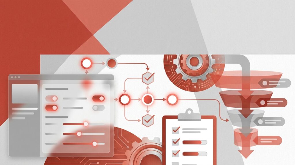
Building Dashboard Visualizations
Once your data is clean and standardized, it’s time to turn those numbers into visuals that inspire action. Effective dashboards make workforce representation patterns easy to understand, helping stakeholders identify gaps and monitor progress – without the hassle of sifting through spreadsheets.
Selecting Visualization Tools
Choosing the right tool is crucial for turning data into actionable insights. Power BI is a smart pick for organizations already using Microsoft 365, as it integrates seamlessly and offers analytics at a reasonable cost. On the other hand, Tableau provides more visual flexibility, making it ideal for more complex enterprise needs. Both tools work well with Skillfuel, ensuring smooth data integration so every metric aligns with your DEI goals.
For HR-specific insights, Visier offers pre-built templates tailored for diversity and inclusion, while Looker Studio excels at creating lightweight, shareable reports with Google integration. Studies show that organizations leveraging advanced analytics make decisions five times faster than their peers. The real challenge? Picking a tool your team will actually use. A fancy platform that gathers dust won’t help anyone.
Building Core Charts and Graphs
The type of chart you choose should match the story your data tells. Here’s how to pair them:
- Bar charts: Great for comparing categories like headcount by ethnicity or department distribution.
- Line graphs: Ideal for showing changes over time, such as progress toward diversity goals or quarterly turnover trends.
- Heatmaps: Perfect for highlighting problem areas, like pay equity gaps or low engagement scores.
For recruitment pipelines, funnel charts can pinpoint where underrepresented candidates drop out during hiring. Grouped bar charts are excellent for uncovering intersectional patterns, such as gender and ethnicity across management levels, revealing potential advancement barriers.
As Carl Anderson, Director of Analytics at Warby Parker, puts it:
"The best analytics teams don’t just report numbers; they tell stories that change behavior".
When designing visuals, start bar chart axes at zero to avoid misleading interpretations, and stick to consistent color schemes across all elements. Use "stack to 100" charts for representation metrics, such as gender distribution by tenure, to make category mixes clear. For small sample sizes, rolling averages can help maintain privacy while still showing meaningful trends.
Once you’ve nailed the basics, take it a step further by adding interactive features.
Adding Filters and Interactive Elements
Static dashboards show what happened, but interactive ones can reveal why. Adding filters for department, location, or job level allows managers to focus on data specific to their teams. This transforms your dashboard from a compliance tool into a hands-on resource for decision-making.
Drill-down actions are another game-changer. For instance, clicking on a KPI card for overall diversity ratios could bring up detailed charts breaking down representation by department or hiring source. A great example is the University System of Maryland’s Diversity and Inclusion Dashboard, which lets users filter workforce data by year, gender, and discipline. Hovering over interactive bar charts reveals exact counts, like the 10,232 underrepresented minority faculty and staff members recorded in 2025.
Hover tooltips are another subtle but effective addition. They provide extra context – like percentages or counts – without cluttering the main visuals. Navigation buttons can also make it easy to switch between sections, such as moving from a high-level summary to detailed recruitment flows.
As Sr. Data Analyst Oluwadunsin "Olu" Agbolabori notes:
"Interactivity features… made the dashboard a powerful decision-making tool, ensuring that HR teams could interact with the data in real time and gain valuable insights at a glance".
Automating Dashboard Updates
Keeping dashboards updated manually is a recipe for outdated insights. A smarter approach? Connect your dashboard directly to your HRIS and ATS. With Skillfuel’s REST API, you can sync workforce data to tools like Power BI, Tableau, or Google Sheets seamlessly. Platforms like Zapier or Make can also help you set up custom workflows to send data exactly where you need it.
For real-time syncing, configure your dashboard to refresh data at regular intervals. For instance, Power BI can pull updates from Skillfuel every 30 minutes when linked to generated file URLs. If you’re handling large datasets, pagination with "skip" and "take" parameters ensures smooth transfers by keeping API requests within the 30-second limit. To avoid system slowdowns, schedule exports during off-peak hours to ensure smooth performance and complete data transfers.
As Factorial highlights:
"Centralizing your data with a DEI dashboard is far more efficient than using manual spreadsheets to track your metrics. You get instant access to clear visuals about your level of diversity, equity, and inclusion".
This automated setup keeps your workforce data current and ready for action.
Configuring Real-Time Data Sync
Start by authenticating with Skillfuel’s credentials (App Key, App Secret, Tenant ID). Use the queryBuilder to filter data – like applying a ModifiedFrom filter – to ensure only updated records are transferred. This allows secure data retrieval from named queries such as DE-Employees for demographics, DE-Departments for organizational structure, and DE-UsersAdditionalInformation for extended DEI tracking. With real-time integration, your dashboard becomes a reliable tool for making informed decisions about diversity and inclusion.
Organizations using automated systems for diversity data capture report 78% response rates for diversity submissions, compared to just 21% with manual methods.
Scheduling Regular Metric Reviews
Automated syncing is just the start. Regularly reviewing your metrics turns raw data into actionable insights. For example, set a recurring review on the first Tuesday of each month at 10:00 AM to spot trends and adjust DEI strategies promptly. This habit ensures you address issues before they grow into larger challenges.
Different teams benefit from varying update schedules. HR and recruitment teams may need daily or real-time updates to monitor hiring pipelines, while department managers might focus on monthly snapshots of retention and promotion trends. For executives, quarterly reports are ideal for strategic planning, and annual summaries work well for external reporting.
To make metrics impactful, assign ownership to specific individuals. When someone is responsible for reviewing updates and driving change, those numbers become a catalyst for action. Hosting quarterly workshops to develop team-based action plans based on dashboard insights can further align efforts with your DEI goals.
Turning Dashboard Data into Action
Now that automated, real-time updates are in place, the focus shifts to turning data insights into actionable steps. A dashboard only becomes meaningful when it drives decisions and measurable change.
Matching Metrics to DEI Goals
Start by clarifying why you’re tracking representation. Is your goal to increase diversity in leadership, reduce turnover among specific groups, or something else? Stick to 5–10 core metrics that directly align with your DEI objectives. Too many data points can overwhelm stakeholders, diluting the impact of your efforts.
Focus on three key layers of measurement: Representation (who is present), Equity (fairness of systems), and Inclusion (sense of belonging). For example:
- If your goal is improving leadership diversity, track metrics like "Promotion Rate by Demographic" and "Time-to-Promotion", broken down by race and gender.
- If retention is a concern, monitor turnover rates for underrepresented groups alongside themes from exit interviews.
Before setting goals, establish a baseline. For instance, document the current percentage of women in management, then set a target like increasing that figure by 15% over 24 months. Assign accountability by designating specific individuals to own each metric, ensuring someone is always responsible for tracking progress and driving action. This focused approach lays the groundwork for engaging stakeholders effectively.
Working with Stakeholders
Dashboards are most impactful when regularly reviewed by those who can act on the insights. Set a consistent review schedule – monthly for HR teams monitoring hiring pipelines, quarterly for department managers focused on retention, or annually for external reporting. Organizations that share regular diversity updates with staff and provide detailed reports to senior leaders can quickly spot trends and adjust strategies to meet their DEI goals.
Tailor dashboard views to fit the audience. Senior leaders benefit from high-level trends and benchmarks tied to business outcomes like innovation or retention. HR teams, on the other hand, need granular data to integrate DEI efforts into succession planning and performance reviews. As Shani Jay from AIHR explains:
"A DEI dashboard is a way for companies to manage their work in diversifying the workforce and creating an inclusive company. Being intentional about what you include… will help you ensure that your dashboard is more than just a nice visualization".
Consider holding quarterly "insight to action" workshops where teams review dashboard data together and brainstorm targeted interventions. When presenting to leadership, use straightforward language that connects DEI insights to business outcomes like profitability, innovation, or talent retention. This connection matters – 70% of job seekers say they’re more attracted to companies that prioritize DEI, making these initiatives a competitive advantage.
Conclusion
Creating an effective dashboard starts with a clear purpose, clean data, thoughtful visualizations, and automated updates. This process transforms raw demographic data into actionable insights. The key difference between a dashboard that sits idle and one that drives hiring decisions lies in how well it aligns metrics with your organization’s DEI goals.
Modern tools like Skillfuel simplify this journey. By automating data cleanup and pulling candidate information directly from your applicant tracking system, Skillfuel eliminates much of the manual work – work that typically eats up 80% of analysis time. This allows HR teams to shift their focus from managing spreadsheets to uncovering insights about the talent pipeline.
Introducing measures like gender-neutral language and blind review processes can significantly increase candidate diversity, with research showing a 67.75% rise in applications. These strategies ensure that the metrics you track reflect meaningful progress rather than superficial changes.
Stefan van Tulder perfectly captures the essence of an impactful dashboard:
"A good dashboard shows problems, a better dashboard shows opportunities".
Your workforce representation dashboard should do both – identify gaps and highlight areas where targeted efforts can deliver the greatest results. With regular reviews and active stakeholder involvement, the dashboard becomes a powerful tool for building a workplace that prioritizes inclusivity and equity.
FAQs
What data sources do I need to build a workforce representation dashboard?
To build a workforce representation dashboard, start by collecting data on employee demographics (like age, gender, and ethnicity), workforce metrics (such as headcount, turnover rates, and hiring trends), and DEI-related insights (including pay equity and promotion rates). You can pull this information from HR systems, analytics tools, and employee surveys. By organizing this data, you can create visualizations that highlight workforce composition, uncover representation gaps, and guide decisions aimed at creating a more balanced and inclusive workplace.
How can I protect employee privacy when tracking demographic metrics?
When tracking demographic metrics, safeguarding employee privacy is essential. Start by anonymizing or aggregating data to ensure individual identities aren’t exposed. Limit access to sensitive information, granting it only to those who absolutely need it, and use secure storage methods to protect against potential breaches.
It’s also crucial to review your data collection processes regularly. This helps identify any vulnerabilities and ensures compliance with relevant privacy laws. Finally, be upfront about what data you’re collecting and how it will be used. Transparency builds trust and keeps your practices aligned with legal requirements.
How often should DEI metrics refresh and be reviewed?
To truly measure progress in diversity, equity, and inclusion (DEI), metrics need regular updates and reviews. Relying on static reports can leave you stuck in the past. Instead, aim for real-time insights and a commitment to continuous learning. This approach ensures your data stays relevant and actionable, allowing you to adapt as circumstances evolve.