If candidates leave your career page without applying, poorly placed CTAs (Call-to-Actions) are often to blame. CTAs guide visitors toward action, but when they’re hidden or hard to find, candidates lose interest. Here’s the bottom line:
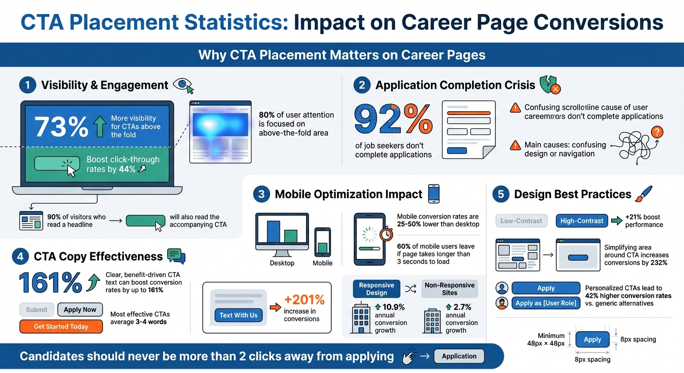
- CTAs above the fold get 73% more visibility and boost click-through rates by 44%.
- 92% of job seekers don’t complete applications, often due to confusing design or navigation.
- Mobile optimization matters: With 90% of job seekers using smartphones, CTAs must be easy to find and click on smaller screens.
To fix this, position CTAs where they’re most visible, use clear, action-driven text, and ensure mobile users can interact effortlessly. Testing placement, design, and wording can also improve performance. Let’s make your CTAs work harder – and smarter.
CTA Placement Statistics: Impact on Career Page Conversions
This Simple CTA Strategy Gets MORE Clicks! (Call-To-Action Breakdown)
Common Problems with CTA Placement on Career Pages
Even the best career pages can falter when CTAs (Call-to-Actions) are poorly placed. Three common missteps – placing CTAs below the fold, neglecting mobile users, and using unclear copy – create unnecessary obstacles that discourage candidates from completing their applications.
CTAs Below the Fold – A Missed Opportunity for Engagement
Here’s the thing: web users spend 80% of their attention on the above-the-fold area. If the "Apply Now" button is buried at the bottom of the page, many candidates won’t even notice it. As VWO aptly puts it, "Out of sight is out of mind".
This issue becomes even more pronounced on mobile devices. With limited screen space, CTAs positioned below the fold require extra scrolling. If candidates have to hunt for the button after reading the job summary, they might lose interest before even starting the application. The golden rule? Candidates should never be more than two clicks away from applying.
And it’s not just about the layout – mobile design adds another layer of complexity.
Poor Mobile Optimization – Losing Candidates on the Go
With the majority of job seekers using smartphones, mobile optimization isn’t optional – it’s essential. Yet, many career pages fail to cater to mobile users. CTAs often get hidden behind chat icons, cookie banners, or feedback surveys. Worse, poorly designed pages force users to zoom in and out, making it easy to miss key information.
Take this example: improving the touch area and ensuring CTAs are placed above the fold can significantly increase mobile interaction rates. But technical hiccups can still ruin the experience. If a page takes longer than 3 seconds to load, 60% of mobile users will leave. Add in obstacles like requiring candidates to download PDFs for job descriptions or forcing them to create a login, and you’ve got a recipe for frustration. These unnecessary steps drive users to abandon the process altogether.
Even when CTAs are perfectly placed, vague or uninspiring text can still derail the application process.
Weak or Vague CTA Copy – Undermining Engagement
Let’s face it – generic phrases like "Submit" or "Click Here" don’t inspire action. Worse, ambiguous terms like "Next" leave candidates guessing what happens after they click. Words that sound like extra work, such as "Register" or "Order", can make applicants hesitate.
"Ambiguity kills conversion. Your CTA should communicate the exact value or benefit users will receive by clicking." – BrowserStack
Clear, benefit-driven CTA text can make all the difference. In fact, it can boost conversion rates by up to 161%. For example, in August 2025, Leadferno helped Fox Pest Control test a new CTA. They swapped out a standard phone-based button for a "Text With Us" widget. The result? A 201% increase in conversions, with leads tripling in just over a month – all without increasing traffic or changing other page elements.
The most effective CTAs are concise, averaging just 3–4 words. This brevity is even more crucial on mobile devices, where 90% of job seekers conduct their search. Short, clear, and compelling copy ensures candidates stay engaged and motivated to apply.
How to Place CTAs for Better Results
Once you’ve pinpointed issues with your CTA placement, it’s time to make changes that can turn casual visitors into applicants.
Above-the-Fold Placement
The hero section is prime real estate for your primary CTA. Studies show that 80% of user attention is focused above the fold, and 90% of visitors who read a headline will also read the accompanying CTA. This is the space where first impressions happen, so high-intent candidates should be able to apply right away.
To make the most of this area, place your primary CTA directly beneath your headline, where the reader’s eyes naturally land after taking in your value proposition. As Karol Andruszków, Founder of BOWWE, explains:
"The fold is your elevator pitch. I like one decisive headline, a two-line subhead, and a single primary button. No sliders, no carousels."
Design matters just as much as placement. Use high-contrast colors to make your button pop – research shows this can boost performance by 21% compared to designs that blend in. Surround the CTA with plenty of white space to improve readability, and use clear, action-oriented text like "Apply Now" or "Join Our Team" instead of vague options like "Click Here".
The data backs this up. For example, the Wise Jobs landing page features a "View all jobs" CTA above the fold, which earned a 95/100 effectiveness score for desktop users. Similarly, Indeed for Employers scored 93/100 with their "Post a job" button, and Publicis Sapient’s careers page achieved 87/100 on desktop and 95/100 on mobile. Including key details like salary ranges alongside your CTA can also help – 43% of entry-level candidates will skip postings that don’t include this information. Adding these details reduces bounce rates and builds trust.
For candidates who need more information before applying, mid-page and bottom CTAs offer additional chances to engage.
Mid-Page and Bottom CTAs
Not every visitor will be ready to apply right away. Some need more context, which is where mid-page and bottom CTAs come into play. These should follow key content like employee testimonials, benefit highlights, or company achievements.
There’s evidence this approach works. Michael Aagaard saw a 304% increase in conversions simply by moving a CTA further down the page for a service that required more explanation.
To guide users effectively, establish a clear visual hierarchy. Your primary action (like "Apply Now") should stand out with bold colors, while secondary options (e.g., "View More Jobs") can appear as ghost buttons – subtle alternatives that don’t compete for attention. For example, Livestorm’s pricing page pairs a vibrant "Get Started" button with a muted "Request Demo" option, while Stripe uses "Create Account" alongside "Contact Sales".
For longer pages, consider a sticky header or footer to keep the "Apply" button visible as users scroll. This is particularly useful for mobile users, who are more likely to scroll to the bottom of a page, making footer CTAs a high-engagement area.
While these strategies improve desktop performance, optimizing CTAs for mobile users is just as important.
Mobile-Friendly Design
Mobile devices present unique challenges for CTAs, with conversion rates often 25% to 50% lower than on desktops. To capture mobile users effectively, adopt these design principles.
First, size matters. Buttons should be at least 48px by 48px with a minimum 8px gap between them to prevent accidental taps. As Brian Massey, Conversion Scientist, notes:
"On desktop the eye is king. On phones, the thumb is queen."
Since 75% of users interact with their phones using their thumbs, place CTAs within the "thumb zone" – the lower and middle-right areas of the screen that are easiest to reach.
Make sure mobile CTAs are visually distinct with a 30% corner radius, drop shadows, and high contrast to signal clickability. Avoid ghost buttons on mobile, as they can lose their visibility on smaller screens.
Sticky CTAs are particularly effective on mobile. Whether you use a sticky header ("headband") or a sticky footer ("sticky shoes"), keeping the primary action visible as users scroll can significantly boost engagement. A small tweak, like replacing the standard copyright text at the bottom of your mobile page with a CTA, can increase conversion rates by 6%.
Simplify your goals for mobile users. Multi-step forms can be frustrating on smaller screens, so consider offering softer CTAs like email sign-ups or "Save for Later" options. Adding trust signals – such as "Takes only 2 minutes" or a privacy policy link – right below the button can also reduce hesitation.
| Element | Mobile Best Practice | Benefit |
|---|---|---|
| Button Size | Minimum 48px × 48px | Prevents accidental taps and improves SEO |
| Spacing | 8px minimum between buttons | Avoids misclicks |
| Placement | Sticky header or footer | Keeps the "Apply" button visible |
| Design | 30% corner radius + shadow | Clearly signals clickability |
| Copy | First-person ("Get My Alerts") | Builds emotional connection |
sbb-itb-e5b9d13
Customized CTAs for Different Candidate Groups
Customizing CTAs (calls-to-action) based on candidate intent can fine-tune your recruitment funnel. Candidates visit your site with varied goals, and relying on generic CTAs often forces everyone into the same rigid process. By tailoring your CTAs to specific groups, you can reduce friction and better address their needs. Building on smart placement strategies, personalized CTAs can take engagement to the next level.
Separate Landing Pages by Candidate Type
Creating dedicated landing pages for specific candidate groups – like recent graduates, seasoned professionals, or departments such as engineering or sales – lets you speak directly to their priorities. Each page should feature a targeted CTA that aligns with the visitor’s intent.
"A recruitment landing page is designed with one very intentional conversion goal: to find the right talent for your business and increase job applicants."
– Jessica Miller-Merrell, Founder of Workology
This method is effective because over half of job seekers visit a company’s website right after seeing a job ad. They expect to quickly find relevant information.
For active job seekers, use direct CTAs like "Apply Now" or "Start Your Career." For passive candidates, softer options like "Join Talent Pool" or "Get Job Alerts" are better suited. If no immediate roles are available, a "Join Talent Pool" button can keep candidates engaged for future openings. Plus, responsive design on these targeted pages can make a big difference – sites with responsive design see a 10.9% annual conversion growth, compared to just 2.7% for non-responsive ones.
Direct Links to Filtered Job Lists
While tailored landing pages cater to specific mindsets, direct links simplify the process for candidates ready to search for roles. Your career homepage should prominently feature a search bar, guiding visitors to filtered job results based on their criteria. CTAs like "View Engineering Jobs", "Explore Sales Roles", or "See Remote Opportunities" can help candidates find exactly what they’re looking for.
John Cotton from Recruitics highlights that top-tier career sites use SEO-friendly URLs that reflect how candidates search. For example, a URL like domain.com/jobs/marketing-director is not only easy to bookmark but also performs well in search engines.
On individual job postings, include features like "Related Jobs" or a "Not a match for you?" section near the main CTA. This minimizes the steps candidates need to take from browsing to applying. Additionally, location-based personalization – using IP tracking to display local job openings – can further refine your CTAs to meet each visitor’s geographic needs.
Testing and Updating Your CTAs
Even the best-performing CTAs need regular testing to stay effective as hiring priorities and candidate expectations shift. One of the most reliable methods is A/B testing – comparing two versions of a CTA to determine which one performs better. To do this, you present the current version (the "control") to one group and a modified version (the "challenger") to another, then analyze the results.
The trick is to keep it simple: test one variable at a time. Changing multiple elements – like button color, text, and placement – at once makes it impossible to pinpoint what actually moved the needle. For example, HubSpot‘s Blog and Academy Acquisition team found that placement had the biggest impact on conversions when they tested messaging, visuals, and positioning separately. Carly Stec summed it up perfectly:
"Keep it simple so success is easier to trace".
When done systematically, A/B testing can boost conversion rates by 15–25%.
How to Get Reliable Results
To ensure your tests are accurate, you need enough traffic and time. For high-traffic sites, aim for at least one week with over 10,000 visitors per variation. If your site sees lower traffic, you may need to run tests for two to four weeks, with around 1,000 visitors per variation. Wait until you reach 95% confidence before making any decisions.
Once you’ve nailed the basics of testing, you can tailor your CTAs to match seasonal hiring trends or specific campaigns. For instance, during peak hiring periods, phrases like "Positions Closing Soon" can create urgency, while during slower times, softer CTAs like "Join Our Talent Pool" might resonate better. Always test during stable periods to avoid skewed or unreliable results.
Keep an Eye on Key Metrics
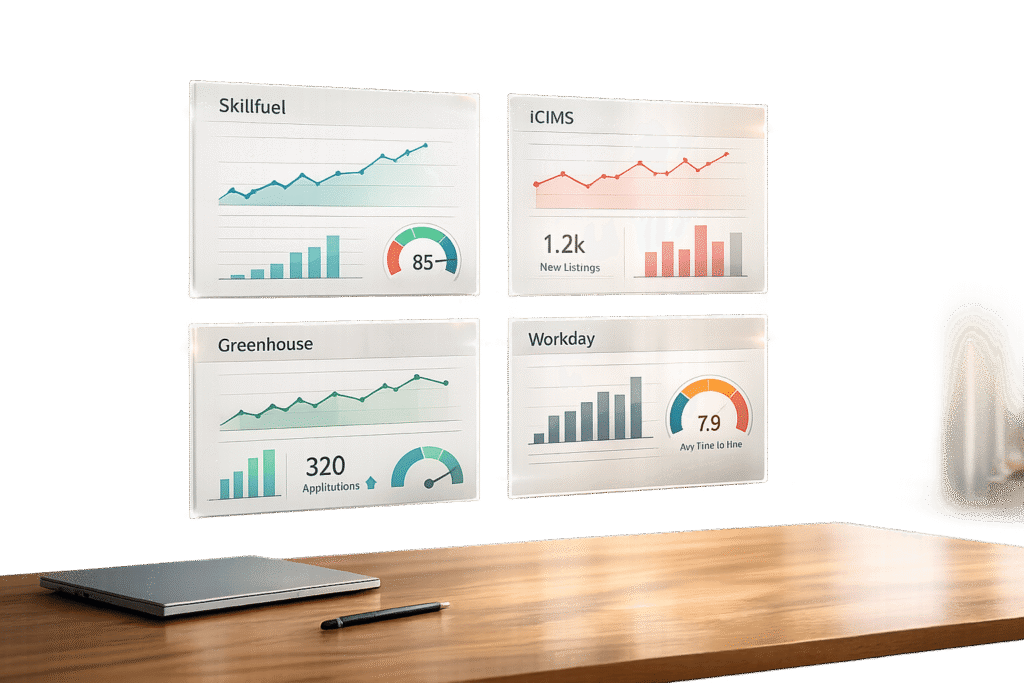
Testing is just the start. To maintain strong performance, use analytics tools to monitor metrics like click-through rates, submission rates, and drop-off rates. These numbers can highlight friction points in your application process. Tools like Skillfuel’s centralized dashboard make this easier by automating tracking, so you can stay on top of applicant profiles and referral progress without extra effort. As Josh Gallant from Backstage SEO puts it:
"Optimization is a mindset. Never stop testing".
Conclusion
Placing CTAs effectively can make all the difference in guiding candidates seamlessly through the application process. When CTAs align with user intent and grab attention at the right moments, they don’t feel forced – they feel natural. With 90% of job seekers relying on mobile devices, even small missteps in placement can result in missed opportunities to connect with top talent.
Simplifying the area around a CTA is another game-changer, as it can increase conversions by 232%. Meanwhile, tailoring CTAs to individual users can lead to 42% higher conversion rates compared to generic alternatives. Emily Buckley, former Head of Content at Wave, sums it up perfectly:
"CTAs may use simple design elements and few words but they contain within them the power to convert visitors into clients or applicants – a mighty feat for a single button".
Reviewing and refining your current strategy is key. Start by auditing your career page. Are your primary CTAs positioned above the fold? Can mobile users interact with them effortlessly, without needing to zoom in? Are candidates always within two clicks of completing an application? These seemingly small adjustments can determine whether a candidate completes the process or abandons it.
Ongoing testing and analysis are crucial for maintaining a strong candidate experience. Tools like heatmaps, A/B testing, and monitoring key metrics can help you identify areas for improvement. Platforms like Skillfuel simplify this process by automating tracking, leaving you more time to focus on refining your approach.
Ultimately, a well-placed CTA can reshape the candidate experience. As John Cotton from Recruitics aptly stated:
"The career site is a crucial step of the recruitment process, and it’s vital to creating a positive candidate experience".
Fine-tune your CTAs to attract and retain top-quality candidates.
FAQs
Why is it important to place CTAs above the fold on career pages?
Placing calls-to-action (CTAs) above the fold is a smart way to grab visitors’ attention right away. This spot ensures users can see the CTA immediately – no scrolling required. And since most people naturally focus on the top portion of a webpage first, this placement works perfectly with their browsing habits.
When you position CTAs prominently at the top, you make it easier for visitors to take action – whether that’s applying for a job, exploring open positions, or connecting further with your brand. This small tweak can have a big impact, driving more engagement and improving conversion rates on your career page.
What’s the best way to optimize CTAs for mobile users?
To make CTAs work well for mobile users, focus on keeping them easy to tap, noticeable, and effective. Aim for button sizes of at least 44×44 pixels, though 60-72 pixels is even better for comfortable tapping. Surround the buttons with enough whitespace to avoid accidental clicks, and position them in key spots, like above the fold or at natural scroll points.
Use high-contrast colors to help CTAs stand out, paired with simple, action-oriented text that highlights the benefit of clicking. For an improved experience, think about adding visual or haptic feedback to confirm when a user interacts with the button. Also, make sure your CTAs follow accessibility standards, such as WCAG, to ensure they’re functional for everyone.
How can I effectively test and improve CTAs on career pages?
To fine-tune and enhance CTAs on career pages, start by using A/B testing. This approach lets you compare different versions of a CTA – experimenting with elements like text, color, or placement – to see which one gets better results. Metrics like click-through rates or conversions will show you what works best for your audience.
Position your CTAs in highly visible spots where users are most likely to interact, such as next to job descriptions or prominently at the top of the page. Use the insights from your tests to make small, targeted adjustments, and keep refining over time. Consistently updating and testing your CTAs ensures they stay engaging and effective at driving user action.