Millions of people with disabilities face difficulties navigating job portals due to poor accessibility. This excludes talented candidates and poses legal risks under the ADA. Accessible job portals improve usability for everyone while ensuring compliance with standards like WCAG 2.1. Here’s what you need to know:
- Follow WCAG 2.1 AA standards: Focus on clear navigation, text alternatives, color contrast, and keyboard-friendly design.
- Accessible forms and buttons: Use descriptive labels, logical tab order, and clear error messages.
- Assistive technology compatibility: Prioritize semantic HTML, ARIA labels, and keyboard navigation.
- Testing is key: Use screen readers, keyboard-only navigation, and user feedback to identify issues.
- Inclusive application processes: Simplify file uploads, provide clear instructions, and offer alternatives like email submissions.
Web Accessibility Tutorial (A11y) – Keyboard Navigation, Aria Tags, Contrast, Semantics and more!
Web Accessibility Standards You Need to Know
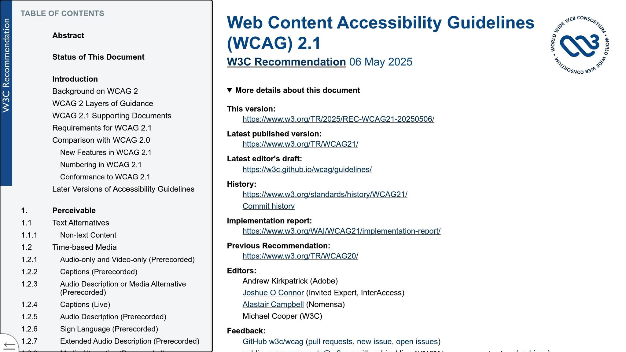
Grasping web accessibility standards is a must when designing job portals that work for everyone. The Web Content Accessibility Guidelines (WCAG) 2.1 set the global standard for digital accessibility, outlining principles to make websites functional for people with disabilities.
At its core, WCAG 2.1 is built on four key principles: Perceivable, Operable, Understandable, and Robust.
- Perceivable: Content should be available to users through sight, sound, or assistive tools like screen readers.
- Operable: All interface elements should be easy to navigate and use.
- Understandable: Content and features should be clear, predictable, and simple to engage with.
- Robust: The portal should work seamlessly across browsers and assistive technologies.
By applying these principles, you can make job portals more inclusive. For example, add text alternatives for images, ensure sufficient color contrast, enable keyboard navigation, and design layouts that work well with screen readers.
WCAG 2.1 Compliance Levels
WCAG 2.1 has three compliance levels: A, AA, and AAA, each with increasing requirements for accessibility.
- Level A: This is the baseline, addressing basic accessibility needs like text alternatives for images, keyboard access, and proper heading structures. While it removes major barriers, it doesn’t guarantee a fully accessible experience.
- Level AA: Often the target for most organizations, this level includes features like enhanced color contrast, scalable text, and clearer error messages in forms. It aligns with ADA standards and offers a more inclusive experience.
- Level AAA: The highest level, with strict criteria such as very high contrast ratios and extensive multimedia support. While ideal, it’s challenging to achieve and often impractical for most websites.
For job portals, Level AA compliance is the sweet spot. It ensures compatibility with screen readers, sufficient contrast for users with visual impairments, and clear form labels, making it easier for all candidates to apply successfully. Platforms like Skillfuel offer tools to help meet these standards effortlessly.
Legal Consequences of Non-Compliance
Failing to make your job portal accessible isn’t just a missed opportunity – it’s a legal risk. Businesses can face lawsuits, hefty fines, and the cost of retroactively fixing accessibility issues.
But the damage doesn’t stop there. Publicized lawsuits can tarnish a company’s reputation, especially as job seekers increasingly value companies that prioritize inclusion.
The legal landscape is also shifting, making accessibility a requirement rather than a choice. Federal agencies and many states enforce accessibility compliance for contractors and vendors. Section 508, for instance, requires federal agencies to procure accessible technology, and similar mandates exist at the state level. Non-compliance can even shut the door on lucrative government contracts and partnerships.
How to Design User Interface Elements for Everyone
When creating a user interface, it’s essential to make it intuitive and accessible for a wide range of users, from those who rely on screen readers to individuals who navigate using only a keyboard. Every visual element on your job portal – buttons, forms, navigation tools – should be designed with inclusivity in mind. This ensures that users with varying abilities can interact with your platform effectively, regardless of the assistive technologies they use.
Let’s break down the key aspects of designing universally accessible UI elements.
Color Contrast and Font Choices
Color contrast plays a critical role in helping users with visual impairments. According to WCAG 2.1 AA standards, the minimum contrast ratio is 4.5:1 for normal text and 3:1 for larger text (18pt or bigger). While these are the minimum requirements, higher contrast ratios often work better, especially for users with low vision or color blindness. For example, dark text on a white background provides excellent contrast, while light gray text on white often fails accessibility benchmarks.
Font selection is another important factor. Sans-serif fonts like Arial, Helvetica, and Verdana are easier to read, especially for users who rely on screen readers. These fonts have simple, clean shapes that remain legible even when zoomed in.
Your design should also accommodate text scaling. Users should be able to adjust font sizes through browser settings without breaking the layout or causing text to overlap. This flexibility is essential for readability and functionality.
Designing Accessible Buttons and Forms
For users with motor impairments, clickable areas need to be large enough – at least 44×44 pixels – to ensure ease of use. Button labels should be descriptive, such as “Apply for Marketing Manager Position,” rather than vague terms like “Submit” or “Click here.” Clear labeling not only improves usability but also aids screen reader navigation.
Input fields must have programmatically associated labels. For instance, instead of a generic error message like “Invalid input,” provide specific guidance such as “Password must contain at least 8 characters, including one number.” This level of detail is particularly helpful for users relying on assistive technologies, who may not notice visual error indicators.
Mark required fields clearly using both visual cues (like asterisks) and text that screen readers can interpret. For example, include the phrase “required field” as part of the field’s accessible name to ensure clarity.
Structuring Navigation for Clarity
A consistent navigation layout across all pages helps users form a mental map of your portal. Logical heading hierarchies (H1, H2, H3) further enhance organization, enabling screen readers to navigate content efficiently.
Features like skip links allow keyboard users to bypass lengthy navigation menus and jump straight to the main content. Breadcrumb navigation helps users maintain context and easily backtrack if needed.
Spacing between clickable elements is more than just a design choice – it’s a functional necessity. Adequate white space minimizes accidental clicks and makes it easier for users with motor challenges to select specific buttons or links. This consideration is especially critical for mobile interfaces, where touch targets need to be larger and well-separated.
Menus should follow predictable patterns. For example, drop-down menus should remain open while users tab through options, rather than closing as soon as the mouse focus shifts. On mobile, hamburger menus must clearly indicate whether they are expanded or collapsed, ensuring screen reader users can navigate them effectively.
Platforms like Skillfuel offer built-in accessibility features that simplify compliance with these guidelines, allowing you to focus on creating an engaging and inclusive user experience rather than worrying about technical details.
Making Job Portals Work with Assistive Technologies
Designing job portals to work seamlessly with assistive technologies is essential for ensuring accessibility for all users. A good starting point is to use clear, semantic HTML. For example, employ elements like <footer> for the footer and wrap each job listing in an <article> tag with a descriptive heading, such as "Marketing Manager – Remote Position." This structure makes it easier for assistive tools to interpret and navigate the content.
ARIA labels (Accessible Rich Internet Applications) can add context to interactive elements. For instance, a salary range slider could include an aria-label like aria-label="Filter jobs by salary range, minimum $40,000, maximum $120,000", helping screen reader users understand its purpose and current settings.
Interactive or informative images should have descriptive alt text. For example, a company logo might include alt text like "TechCorp company logo – click to view profile." Similarly, form inputs need explicit labels using the for attribute. When a user focuses on an email input field, a screen reader might announce, "Email address, required, edit text", making the field’s purpose clear.
Dynamic content updates should be managed with aria-live regions. For example, when new job listings are added to search results, the system can announce, "3 new jobs matching your criteria have been added." This ensures users are informed of updates without needing to refresh the page.
Beyond semantic HTML, effective keyboard navigation is a cornerstone of accessibility.
Keyboard Navigation Setup
Many users rely solely on keyboards to navigate websites, whether due to motor impairments or personal preference. A job portal must support smooth keyboard navigation to accommodate these users.
Logical tab order is critical. The tab sequence should follow the visual layout, typically progressing from top to bottom and left to right. Stick to the natural flow of HTML rather than overusing the tabindex attribute.
Focus indicators must be highly visible. While some designers remove default browser focus outlines for aesthetic reasons, they should replace them with alternatives – such as a blue border or a background color change – that meet contrast requirements. This ensures users can always see where their focus is.
Skip links are another helpful feature. These allow users to bypass repetitive navigation and jump directly to the main content. For example, a link labeled "Skip to job search results" can be placed at the top of the page. While these links can be visually hidden, they should become visible when focused.
Dropdown menus and modal dialogs require special keyboard handling. Dropdowns should open with the Enter or Space key, allow navigation with arrow keys, and close with the Escape key. Modal dialogs should trap focus within the dialog until it’s closed, preventing users from accidentally tabbing to content in the background.
All interactive elements, such as job application buttons, search filters, and pagination controls, must be fully operable using the keyboard. Custom JavaScript widgets can sometimes disrupt keyboard navigation, so thorough testing is essential to ensure everything works smoothly without a mouse.
How to Test with Assistive Technologies
Once your portal is designed with accessibility in mind, it’s important to test it with assistive technologies to identify any issues automated tools might miss. Hands-on testing provides critical insights into the real user experience.
Screen reader testing is a must. Different screen readers interpret content in unique ways, so it’s important to test with a range of programs. NVDA is a free option for Windows, JAWS is a widely used commercial tool, and VoiceOver is built into macOS and iOS devices.
Keyboard-only navigation testing is equally important. Navigate your portal using just the keyboard to ensure all interactive elements are accessible and essential tasks can be completed. Pay close attention to logical tab order and focus indicators – if a feature isn’t accessible via the keyboard, users with motor impairments may be excluded.
Browser zoom testing ensures your portal remains functional when users increase text size up to 200%. Many people with low vision rely on browser zoom rather than specialized magnification software. At various zoom levels, make sure text doesn’t overlap, buttons remain clickable, and horizontal scrolling isn’t necessary.
Automated testing tools like axe-core or WAVE can quickly identify technical issues, such as missing alt text or poor color contrast. However, these tools can’t evaluate subjective factors like content clarity or intuitive navigation, so they should be used alongside manual testing.
Finally, user testing with individuals who rely on assistive technologies provides the most valuable feedback. Recruit people who use screen readers, voice recognition software, or other tools to navigate your portal. Their insights often uncover usability issues – like confusing layouts or inefficient navigation – that technical tests might overlook.
Platforms like Skillfuel offer accessibility testing features to help detect and resolve compatibility problems early in development. Regular testing throughout the process is key to avoiding costly fixes down the line.
sbb-itb-e5b9d13
Creating Accessible Job Application Processes
An accessible job application process is essential for engaging all job seekers, especially candidates with disabilities. Unfortunately, many application workflows unintentionally create barriers, particularly for those relying on assistive technologies or alternative navigation methods. These obstacles often stem from poorly designed forms, unclear instructions, inadequate error handling, or file upload systems that are difficult to use.
To create an inclusive experience, it’s important to address these challenges head-on. The aim is to design workflows that accommodate everyone, regardless of their abilities or the tools they use.
Accessible Form Design Principles
Accessible forms are the backbone of inclusive job applications. Each form element should include clear, detailed instructions. For example, instead of using a vague label like "Name", opt for something more specific, such as "Full legal name as it appears on government ID." Proper labeling is also key – each form field should have an explicit label linked to it using the for attribute. This ensures that screen readers can announce the label correctly, like "Email address, required, edit text."
Keyboard navigation plays a big role in usability. Logical tab order should follow the visual layout of the form – top to bottom, left to right – without unexpected jumps. Avoid altering the natural tab order unless absolutely necessary, as this can disrupt predictable navigation patterns for users who rely on them.
Focus indicators are another crucial element. While some designers remove browser default focus outlines for aesthetic reasons, they must replace them with visible alternatives, such as a blue border or background color change, that meet contrast requirements. This helps users track their position within the form.
Error handling should be straightforward and accessible. Error messages need to appear near the relevant field and use plain language to explain the issue. For instance, instead of saying "Invalid input", provide clear guidance like "Phone number must include area code and use the format (555) 123-4567." Use ARIA-live regions to ensure screen readers announce error messages dynamically, so users don’t have to search the form for validation problems. Also, avoid relying solely on color to indicate errors, as users with color vision deficiencies may not notice them.
Once forms are optimized, it’s important to extend accessibility to file submission options.
File Upload Options for All Users
File uploads can be a sticking point for many users, especially those with motor impairments or assistive technology needs. Offering multiple ways to upload files ensures that all candidates can submit their applications successfully.
Include a traditional file picker button alongside drag-and-drop functionality. The file picker should be clearly labeled for screen readers with text like "Choose resume file" and be fully accessible via keyboard navigation. Make sure users can activate the file picker using both the Enter and Space keys.
For those who encounter issues with file uploads, provide a backup option. For example, include instructions like: "If file upload fails, email your resume to jobs@company.com with the job title in the subject line." This ensures no candidate is excluded due to technical difficulties.
Another alternative is to allow applicants to paste their resumes directly into a text field. A large text area labeled "Paste resume content here" gives users flexibility, especially if their assistive technology struggles with file upload controls.
Finally, specify file format and size requirements upfront. For example, "Accepted formats: .docx, .pdf, or .txt files under 5MB." This clarity helps users prepare their documents correctly and minimizes submission errors.
Beyond forms and file uploads, it’s important to address accessibility in video interview processes.
Making Video Interviews Accessible
Video interviews are now a standard part of hiring, but they can pose challenges for candidates with hearing, vision, or motor impairments. To make these interviews accessible, certain accommodations are essential.
Start with closed captions and transcripts. Real-time captions that accurately capture both the interviewer’s and candidate’s speech are critical. Test the captioning quality beforehand, as poor automatic captions can create confusion. For key interviews, consider using human captioning services, which typically offer higher accuracy.
Ensure video controls – like play, pause, mute, and camera toggle – are operable via keyboard and labeled for assistive technologies. Candidates should be able to join meetings, adjust settings, and participate fully without needing a mouse.
Alternative formats can further expand accessibility. For example, offer audio-only interviews for candidates with visual impairments or limited internet bandwidth. Text-based interviews via chat platforms can also accommodate individuals who are deaf or hard of hearing.
Testing the platform is essential. Use assistive technologies such as JAWS, NVDA, or VoiceOver during testing to identify compatibility issues before interviews take place. This proactive approach helps avoid last-minute problems and ensures a smoother experience for all participants.
Recruitment tools like Skillfuel can simplify this process. These platforms offer accessible form templates, alternative file upload options, and integration with accessible video interview platforms, making it easier to create inclusive hiring workflows while staying compliant with accessibility standards.
The importance of these efforts is underscored by the 2022 WebAIM survey, which found that 98.1% of home pages had detectable WCAG 2 failures. By prioritizing accessibility in job application processes, organizations can connect with talented candidates who might otherwise be excluded from traditional hiring methods.
Writing Content That Works for All Users
When job seekers come across confusing language, overly complex instructions, or unclear details, it can make the application process unnecessarily difficult. Using plain language helps address these challenges, ensuring that critical information is accessible to everyone, including candidates with cognitive disabilities and those who are non-native English speakers. Let’s explore how plain language and well-organized content can make a big difference for all users.
Plain Language and Content Organization
Plain language enhances usability by cutting out unnecessary jargon, simplifying sentence structures, and presenting information in a logical order. This approach benefits everyone, including individuals who rely on screen readers, those with cognitive disabilities, and people who may not be fluent in English.
Just like a user-friendly interface improves accessibility, clear and straightforward content empowers users. For example, in job descriptions, swap out phrases like "synergistic cross-functional collaboration" for something simpler like "working with different teams." Similarly, instead of vague or trendy terms like "seeking a rockstar ninja", specify the actual role, such as "looking for an experienced software developer." These changes make job requirements crystal clear.
The way sentences are structured also matters. Stick to active voice for better clarity – for instance, say, "The hiring manager reviews applications" instead of a passive alternative. Break up information into short paragraphs and use clear headings, such as "Required Skills" or "Application Deadline", to help users quickly find what they need.
The push for plain language isn’t new. Standards like the Plain Writing Act of 2010 have encouraged organizations to adopt these practices. Importantly, plain language doesn’t mean oversimplifying or dumbing things down. It’s about presenting detailed and nuanced information in a way that’s accessible to a broader audience.
Building Job Portals That Work for Everyone
Creating accessible job portals isn’t just a nice-to-have – it’s a necessity for reaching a broader, more diverse talent pool. With over 1.3 billion people worldwide living with disabilities and about 1 in 6 individuals experiencing some form of disability, accessibility in design can significantly widen your reach. Yet, the reality is stark: 96% of the world’s top one million homepages remain inaccessible to people with disabilities.
To make job portals truly inclusive, they need to follow four key principles: perceivable, operable, understandable, and robust. These principles transform technical guidelines into actionable steps for creating inclusive designs.
Ignoring accessibility can cost you talented candidates and even tarnish your first impression. For example, red-green colorblindness affects up to 8% of men, yet many portals rely on color-only indicators for required fields or application statuses. This design choice can unintentionally exclude a significant portion of potential applicants. And with 94% of first impressions being design-related, these oversights can have a lasting impact.
Accessibility isn’t a one-and-done effort – it requires regular audits, user testing, and staying updated with evolving standards. By embedding accessibility into the development process from the very beginning, you create a hiring platform that benefits everyone, not just those with disabilities. This proactive approach ensures your hiring process is seamless and inclusive at every step.
At Skillfuel, these principles are woven directly into their development tools. By prioritizing accessibility, Skillfuel helps organizations build job portals that not only comply with legal standards but also connect them with qualified candidates from all walks of life. This commitment enhances the hiring experience for everyone involved.
FAQs
How can I make sure my job portal meets WCAG 2.1 AA accessibility standards?
To make sure your job portal meets WCAG 2.1 AA standards, begin with a detailed accessibility audit. This will help pinpoint any obstacles that might prevent users with disabilities from navigating your site effectively. Key improvements to prioritize include keyboard-friendly navigation, high-contrast color options, and compatibility with screen readers – all of which significantly improve user experience.
It’s also crucial to test your portal regularly using assistive technologies to ensure everything works as intended. By embedding accessibility considerations into your design and development process from the very beginning, you can avoid costly fixes later. Keep an eye on updates to WCAG guidelines to stay compliant and ensure your portal remains welcoming and functional for everyone.
How can I make sure my job portal is accessible to people with disabilities?
When making your job portal accessible, start with automated accessibility testing tools. These tools can spot common problems like missing alt text or inadequate color contrast. But don’t stop there – take it further with manual testing by involving users with disabilities. This hands-on approach reveals practical challenges and ensures the portal is user-friendly. By combining both methods, you can align with WCAG guidelines and provide an inclusive experience for everyone.
What legal risks could I face if my job portal isn’t accessible?
If your job portal falls short of accessibility standards in the United States, you might find yourself facing legal challenges under the Americans with Disabilities Act (ADA). This law mandates that websites must be accessible to individuals with disabilities. Ignoring these requirements could lead to lawsuits, financial penalties, and even damage to your company’s reputation.
Courts are increasingly treating online accessibility as a legal necessity. Non-compliance doesn’t just open the door to expensive legal battles – it can also send the wrong message about your values. Making your portal accessible not only helps you avoid legal trouble but also shows a commitment to inclusivity. Plus, it broadens your reach, allowing you to connect with a larger and more diverse pool of talented candidates.

